Next-Gen UI/UX Strategies
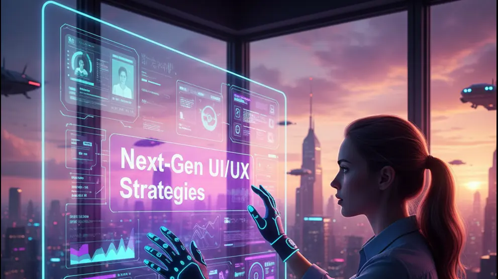
Next-Gen UI/UX strategies focus on creating intuitive, engaging, and seamless user experiences. From user-centered design to micro-interactions, motion, accessibility, and data-driven decisions, modern interfaces combine aesthetics with functionality to delight users across devices. These approaches help businesses improve engagement, conversions, and overall user satisfaction.
Simple Content Management for Modern Websites
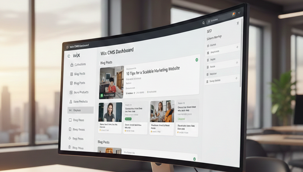
A simple content management system helps businesses and creators manage websites efficiently without technical complexity. It enables fast updates, consistent design, and scalable content management for modern websites.
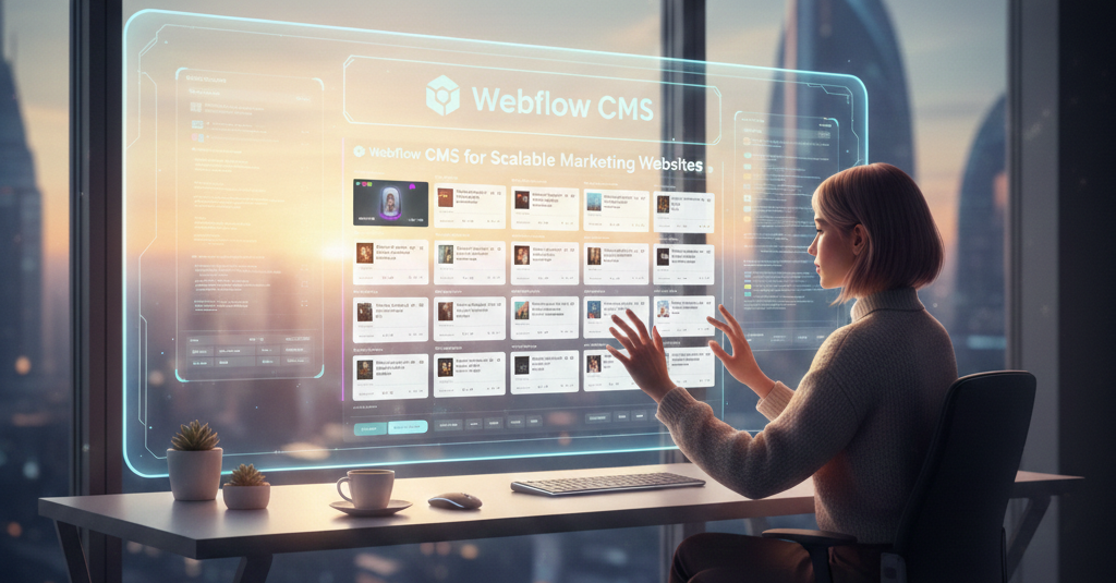
Webflow CMS for Scalable Marketing Websites
Framer CMS is a modern, design-first content management system that allows creators to build fast, responsive, and visually rich websites with ease. It simplifies content management while giving full creative control—without the complexity of traditional CMS platforms.
Framer CMS for Modern Websites

Framer CMS is a modern, design-first content management system that allows creators to build fast, responsive, and visually rich websites with ease. It simplifies content management while giving full creative control—without the complexity of traditional CMS platforms.
UI/UX Trends Redefining Experience
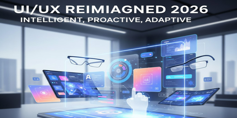
Designing with a mobile-first UI/UX approach is essential, as user experience across devices directly impacts engagement and retention. A responsive interface ensures layouts, interactions, and visual elements adapt seamlessly from smartphones to desktops. Strong mobile UI/UX improves usability, user satisfaction, and overall product performance.
SEO
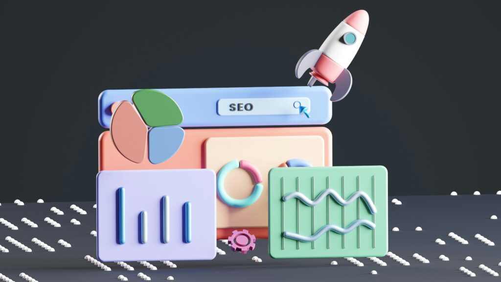
Developing a mobile-friendly website is essential, as Google considers mobile responsiveness a key ranking factor. A responsive design ensures your website displays correctly on all devices, from smartphones to desktops, providing a seamless experience for users. Mobile optimization not only improves user engagement but also positively impacts search engine rankings.
E-COMMERCE
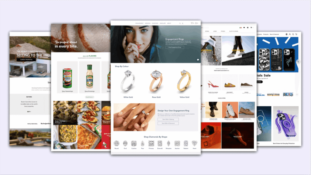
Introduction to E-Commerce E-commerce has revolutionized the way businesses sell products and services, bringing the marketplace into the digital realm. It enables companies to reach customers globally, facilitating convenient online shopping experiences. What is WooCommerce? WooCommerce is a robust and widely-used e-commerce plugin for WordPress. Developed by Automattic, it transforms WordPress websites into fully […]
ANIMATION

Introduction to Animation Animation is a captivating form of visual storytelling that brings characters, objects, and ideas to life through motion. By combining images in sequence, animation creates engaging narratives that connect emotionally with audiences. It is widely used to inform, entertain, and inspire viewers across different platforms. Types and Styles of Animation Animation […]
Bootstrap

Mobile-First and Responsive Design Bootstrap follows a mobile-first approach, meaning websites are designed for smaller screens first and then scaled up for larger devices. This ensures a seamless user experience across smartphones, tablets, and desktops. Its responsive grid system automatically adjusts layouts based on screen size. Bootstrap Grid System The Bootstrap grid system is […]
WordPress
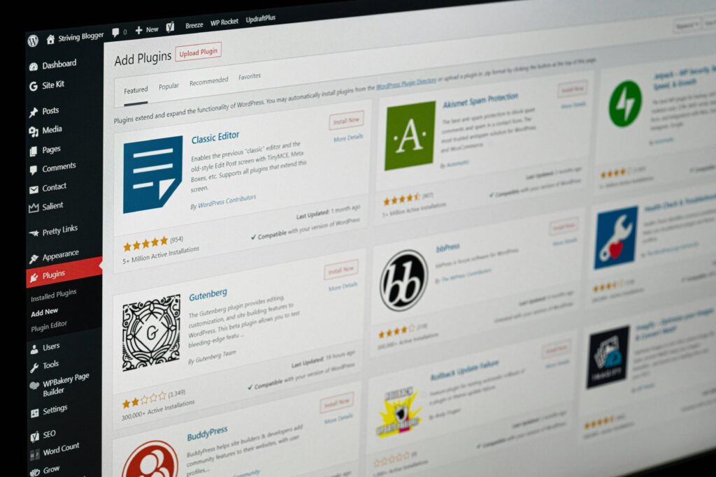
Why WordPress Rules the Web WordPress is easy to use, highly flexible, and perfect for creating websites of any type. From blogs to business sites, it offers endless possibilities to bring your ideas online. Build Websites Fast with WordPress With WordPress, you can quickly create professional blogs, business websites, or online stores without any […]