Web Development

Bootstrap

Mobile-First and Responsive Design Bootstrap follows a mobile-first approach, meaning websites are designed for smaller screens first and then scaled up for larger devices. This ensures a seamless user experience across smartphones, tablets, and desktops. Its responsive grid system automatically adjusts layouts based on screen size. Bootstrap Grid System The Bootstrap grid system is […]
WordPress
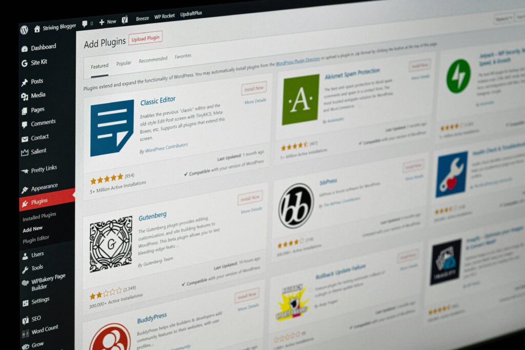
Why WordPress Rules the Web WordPress is easy to use, highly flexible, and perfect for creating websites of any type. From blogs to business sites, it offers endless possibilities to bring your ideas online. Build Websites Fast with WordPress With WordPress, you can quickly create professional blogs, business websites, or online stores without any […]
Digital Marketing & Brand Growth